

We boldly assert that creative websites on Tilda are our thing. However, to create a conceptual product, it is important to develop a unique corporate identity first. And it all starts with a logo.
Initially, we developed three variants for OGANOV brand, each of which has its own fans among our and the client's team
Initially, we developed three variants for OGANOV brand, each of which has its own fans among our and the client's team
First: Pure and Juicy
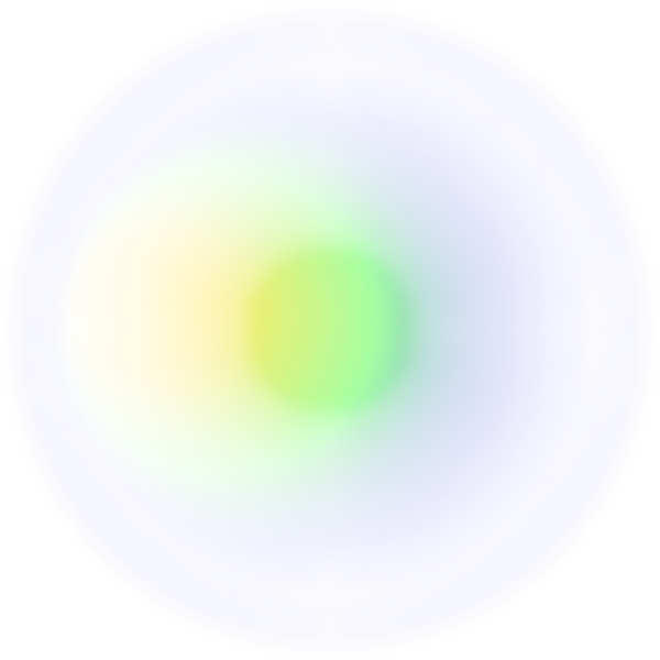
We mixed modern graphic design trends - large typography, abstract elements, and gradients. Сombination of grey and green allowed us to create a glow and ripple effect, which coolly emphasizes the slashed typography in the logo.
Triangle stands as our main graphic elements: an association with the start, launch, and promotion of a new business, and a circle, which refers to a full range of marketing services
Triangle stands as our main graphic elements: an association with the start, launch, and promotion of a new business, and a circle, which refers to a full range of marketing services


Second. Bright and Contrasting
This variant took the classic black and white color palette, adding a striking and contrasting red. Thus, the simple font logo became bright and recognizable without losing its readability and brevity.
The highlighted letter 'A' served as a trademark, which can be recognized in any context and used as a separate graphic element in the design. Look closely and you can see an upward-pointing arrow in the outline
The highlighted letter 'A' served as a trademark, which can be recognized in any context and used as a separate graphic element in the design. Look closely and you can see an upward-pointing arrow in the outline


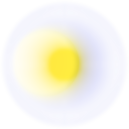
Third. Upbeat and Robust
We based on Panton 2021 colors, a flawless grey, and a refreshing yellow, smoothing out the contrast with a gradient. The minimalistic typeface doesn't overpower the lush concept.
In an easy-to-understand logo a looped arrow embedded in the letter "G" reflects the full cycle in the marketing agency's services
In an easy-to-understand logo a looped arrow embedded in the letter "G" reflects the full cycle in the marketing agency's services

Of the three bold options, the first - the most futuristic - was adopted without any changes. The logo defined not only the style of the future website but also the entire media brand development

Why do we make a video?
Time goes by, websites can be changed or even deleted, so we want to save them and show to you in their original version :)
Liked it?


We'll send you our full portfolio with all the details
Ready to discuss?


Ready to discuss?
By pressing "submit" you automatically agree with "Privacy Policy"
All rights reserved
